
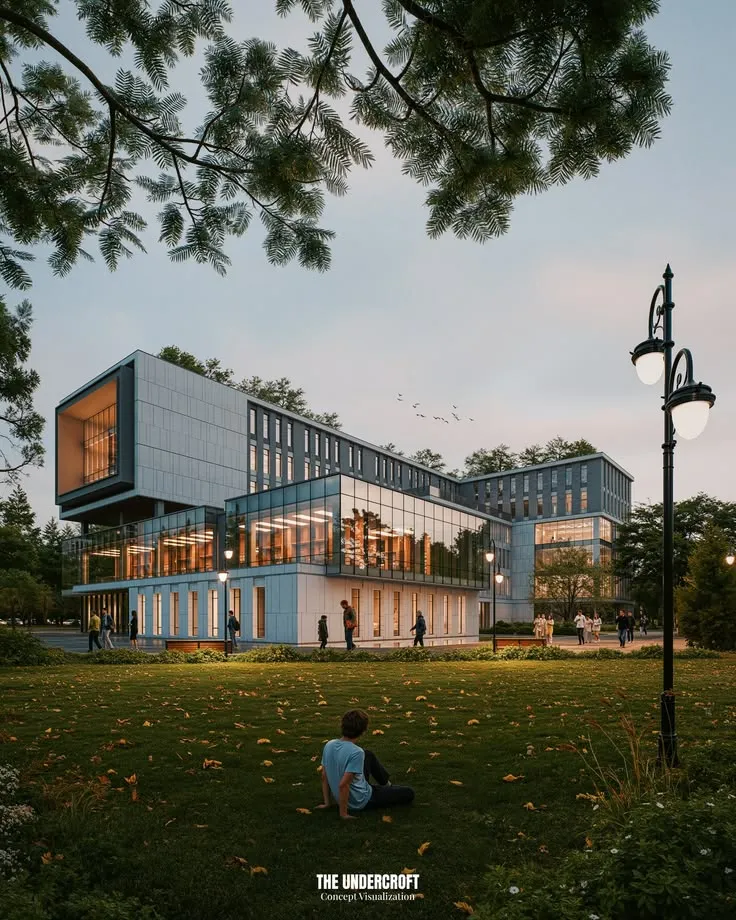
A building can look excellent on its own and still feel wrong once it is placed on the real site. The entrance may face the wrong activity zone. A large paved area might dominate the landscape. The building could appear too heavy beside its neighbours, or the proposed planting may not do enough to soften the development. These issues are difficult to judge when a design is viewed only as an isolated model.
That is why exterior visualisation becomes more useful when designers think beyond the façade. An AI exterior design generator can help architects explore the character of an individual building, while wider masterplan visualisation can show how buildings, roads, landscape, open spaces, and movement networks relate to one another. AI Render Studio supports both kinds of visual study, allowing design teams to move between close architectural views and broader site-level thinking.
The technology can speed up that exploration, but the real value comes from something more basic: seeing the project in context before too many decisions become fixed.
A Beautiful Façade Is Only Part of the Story
Exterior design usually receives plenty of attention. Materials are compared, window proportions adjusted, entrances refined, and rooflines reconsidered until the building begins to develop a recognisable identity.
These decisions matter, but people rarely experience architecture as a perfectly framed elevation.
They approach it along a street. They see it behind trees. They move through parking areas, courtyards, footpaths, or public spaces before reaching the door. Other buildings may sit beside it, while landscape and topography change how large or small the development feels.
A façade that works in isolation therefore needs to be tested as part of a bigger composition.
Consider a new community building. On a clean white background, its timber and masonry exterior may appear balanced. Once it is placed within a wider site containing existing trees, pedestrian routes, neighbouring homes, and parking, different questions begin to emerge.
Does the entrance remain obvious?
Does the building turn its back on an important public space?
Is there enough landscape between the building and nearby properties?
Suddenly, visualisation is doing more than showing finishes. It is helping the team understand relationships.
Work From the Building Outwards
A useful architectural workflow does not necessarily begin with a highly detailed masterplan.
Sometimes it makes more sense to start close.
Take one important view of the building and explore its basic exterior character first. The designer might test a lighter façade, a stronger entrance, deeper window reveals, or a softer relationship between the ground floor and surrounding landscape.
Once a promising direction starts to emerge, the view can widen.
Now the team considers what happens around the building. Pathways matter. Drop-off points appear. Existing vegetation becomes relevant. The position of another building may affect views or sunlight.
This gradual shift from object to context can make design decisions easier to understand because each stage asks a slightly different question.
At building scale:
- What gives the façade its character?
- Is the entrance easy to recognise?
- Do the materials create the right visual weight?
- How does landscaping meet the ground floor?
At site scale:
- How do people arrive and move through the development?
- Which spaces feel public, shared, or private?
- How do individual buildings relate to one another?
- Is landscape connecting the site or simply filling leftover space?
Both sets of questions matter, but they are easier to answer when visualisation is used deliberately rather than all at once.
Context Can Completely Change a Design Decision
Imagine a residential scheme where an architect is considering dark brick for the main building.
In a close exterior render, the material might look sophisticated. Strong shadows and warm interior lighting could create exactly the atmosphere the team wants.
Then the development is seen as part of a larger group.
If every building uses the same dark material, the whole masterplan may suddenly feel much heavier than expected. Perhaps lighter secondary buildings would create a better hierarchy. Maybe the dark brick should be concentrated around key public areas instead of appearing everywhere.
Neither image is necessarily wrong.
The close view answers one question, while the larger view reveals another.
This is why moving between architectural and masterplan scales is so useful. Decisions that appear successful at one level can produce unexpected results at another.
Masterplans Need to Communicate More Than Plot Boundaries
Traditional masterplans are rich in information. Architects, planners, urban designers, and landscape professionals can read building footprints, road hierarchies, open spaces, and land-use patterns from a drawing without much difficulty.
Not every audience can.
A client or community stakeholder might understand where a building sits but still struggle to imagine what the place could feel like. A planning discussion may involve people who are comfortable with maps but want a clearer sense of scale, character, and landscape.
This is where AI masterplan rendering can support communication.
AI Render Studio’s masterplan workflow accepts visual inputs such as site plans, masterplan layouts, aerial views, urban diagrams, and exports from CAD or GIS workflows. It can then create visual studies that introduce buildings, roads, vegetation, landscape, water features, and atmospheric context.
The resulting image does not replace the actual masterplan.
Instead, it can sit alongside it.
The technical drawing explains where things are. The visualisation helps explain what the overall development might feel like.
Different Viewpoints Tell Different Stories
One masterplan image is rarely enough to communicate a large site properly.
A bird’s-eye view is excellent for showing the overall organisation. Roads, blocks, green corridors, water, and key destinations can all be understood together.
Move closer, however, and different issues become visible.
An elevated perspective may show how building heights step across the development. An eye-level view can reveal whether a central public space feels enclosed or exposed. A street-level image might demonstrate how pedestrians experience a particular route.
AI Render Studio’s current masterplan workflow supports several kinds of viewpoints, including aerial, elevated, and eye-level perspectives.
Rather than choosing a camera angle simply because it looks impressive, teams can match the view to the question being asked.
For example:
Need to explain site organisation? Use a broader aerial view.
Comparing building scale? An elevated perspective may be clearer.
Reviewing pedestrian experience? Move towards eye level.
Discussing a public square? Frame the space from a position someone might actually occupy.
The camera becomes part of the design conversation.
Landscape Should Be Designed, Not Sprinkled Around the Render
There is a common visualisation shortcut: if an architectural image feels empty, add more trees.
It works surprisingly often from an aesthetic point of view. Greenery softens façades, fills blank areas, introduces scale, and makes developments look established.
But landscape architecture is not decoration.
Trees require space. Planting has to suit the climate. Paths need a purpose. Open spaces should respond to how people will actually use them. Water features, lawns, and planted areas all carry maintenance and practical implications.
AI can help a team explore landscape character quickly. The masterplan workflow, for instance, can introduce vegetation, pathways, lawns, and other site elements, with prompts used to guide different environmental directions.
The visual result should still be questioned.
A useful response might be:
“The avenue of trees gives this route a stronger identity.”
A less useful response would be:
“The AI added twelve trees here, so twelve trees should be built.”
The image suggests a principle. Landscape professionals then determine how that principle can work on the real site.
Early Visuals Can Expose Weak Connections
One of the underrated benefits of contextual rendering is the ability to notice awkward leftover spaces.
These are often less obvious in abstract drawings.
Perhaps two buildings create a narrow strip of land with no clear purpose. Maybe a pedestrian route ends abruptly at a parking area. A public courtyard might appear much larger and less comfortable than it seemed on the plan.
Once people, vegetation, shadows, and architectural scale are visible, those spaces become easier to judge.
This can be especially helpful early in masterplanning, when substantial changes are still possible.
The team may decide to:
- reposition one building;
- reduce an oversized hardscape area;
- strengthen a pedestrian connection;
- introduce a better landscape buffer;
- create a clearer centre to the development;
- reconsider where active ground-floor uses face the public realm.
None of these decisions needs to originate from AI.
The visual simply gives the design team another way to notice the problem.
Do Not Confuse Visual Plausibility With Planning Accuracy
Masterplan images can be persuasive. That makes them useful, but it also creates responsibility.
A highly polished visual may appear far more certain than the actual stage of the project.
AI could add trees that do not exist, suggest building details that have not been designed, or interpret a simple footprint in ways that differ from the architect’s intention. At masterplan scale, even small visual assumptions can affect how viewers understand density, landscape, or building character.
Technical information should therefore remain grounded in the real project documents.
Issues such as these still need proper analysis:
- site boundaries;
- dimensions and setbacks;
- access requirements;
- parking and servicing;
- building heights;
- density;
- drainage;
- topography;
- environmental constraints;
- planning policy;
- accessibility;
- infrastructure.
A generated image is better treated as a communication or concept-development layer, not evidence that these matters have been resolved.
Use Fewer Images, but Give Each One a Purpose
Fast rendering can create a folder full of options surprisingly quickly.
That does not necessarily help.
For an exterior study, three carefully selected images may be enough: one showing the agreed direction, one testing a genuine alternative, and one demonstrating how the building behaves under a different lighting condition.
A masterplan presentation can follow the same principle.
Instead of showing numerous similar aerial views, select images that explain different aspects of the project. One may show the overall structure. Another could focus on landscape. A third might bring viewers closer to the main public area.
This makes presentations easier to follow and avoids overwhelming people with visual variations that do not change the design discussion.
Good visual communication depends as much on editing as it does on generation.
Bring Useful Ideas Back Into the Actual Project
AI visualisation works best as part of a loop.
A team begins with its real drawing, model, or site plan. It produces a visual study. The study reveals something interesting. That observation then goes back into the working design.
Maybe an exterior render shows that the entrance needs stronger contrast.
The BIM model is updated.
Perhaps the masterplan visual suggests that an important pedestrian route lacks a clear destination.
The site plan is reconsidered.
Another image may reveal that a development would benefit from a stronger landscape spine connecting its public spaces.
The landscape strategy is then developed properly.
This feedback loop prevents rendering from becoming a separate exercise concerned only with appearance.
The image should influence the project only when the underlying idea stands up to architectural scrutiny.
Detail and Context Should Support Each Other
Architects often move constantly between scales.
One minute they are considering the width of an entrance canopy. The next they are discussing how the entire development relates to the surrounding neighbourhood.
Digital visualisation should be able to support the same way of thinking.
Close exterior views help people understand materials, façade rhythm, entrances, lighting, and architectural character.
Broader masterplan views reveal spatial hierarchy, movement, landscape, density, and relationships between different parts of the site.
Neither tells the complete story.
When the two are considered together, however, design teams gain a more rounded picture of what they are creating.
Conclusion
Architectural visualisation becomes more useful when it stops treating a building as an isolated object. Exterior character matters, but so do arrival, landscape, neighbouring structures, open space, circulation, and the wider organisation of the site.
AI-assisted rendering gives architects, urban designers, and landscape teams a quicker way to move between these different scales. A close view can test the personality of a façade, while a wider masterplan study can reveal whether that building belongs comfortably within the development around it.
The important part is keeping the visualisation connected to real design questions. AI can help show possibilities and expose relationships that deserve attention, but plans, models, professional expertise, and site-specific decisions still determine what can actually be built.
A successful project needs both views: the building people remember and the place around it that makes the building work.
Top of Form
Bottom of Form